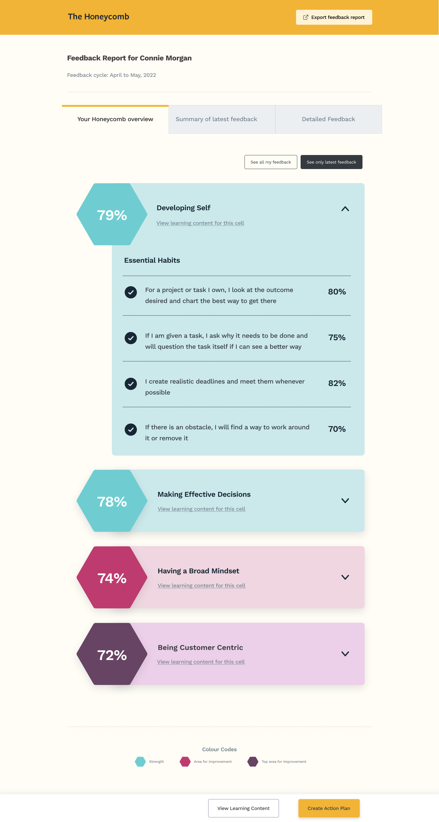
Designing a feedback report experience for The Honeycomb's 360-degree peer feedback platform.
Context
The Honeycomb is a peer feedback and learning platform I built from the ground up at The Honeycomb Works, in partnership with the Royal Academy of Engineering. It helps engineering startups develop inclusive, high-performing team cultures — and has been adopted by over 38 companies across the UK.
At its core, The Honeycomb collects 360-degree feedback: people rate each other on specific inclusion behaviours across different "cells" (themes like Amplifying Voices, Transparent Leadership, or Delivering Feedback). The challenge was how to present that data in a way that actually drives behaviour change — not just generates reports nobody reads.
The Problem
Early versions of the report surfaced raw percentages. Users saw a score of 70% for "Challenging Biased Communication" but had no frame of reference. Was that good? Bad? How did others see them compared to how they saw themselves? What should they do next?
People were getting feedback but not doing anything with it. They didn't know what the numbers meant or where to start. The report had to do more work.
Research synthesis from user sessions with The Honeycomb participantsThree core problems emerged from user interviews and usability testing:
Users couldn't see the gap between how they rated themselves and how others rated them — the most actionable insight for behaviour change.
The original layout presented all behaviours equally. Users didn't know where to focus or what warranted attention.
After reading their report, users had nowhere to go. The platform had learning content and action plan tools, but they weren't surfaced meaningfully from the report view.
Starting Point
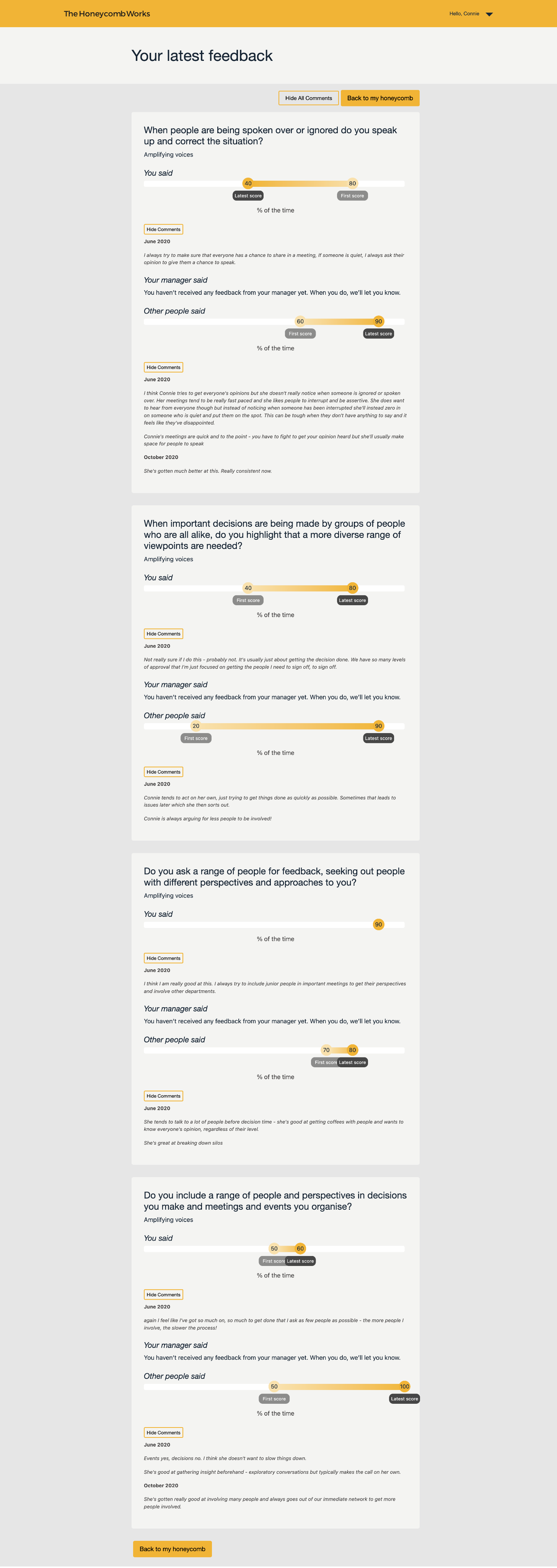
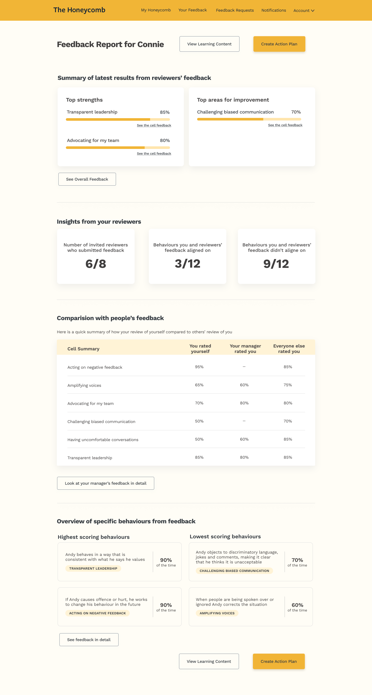
The original "Your latest feedback" view presented every behaviour as an identical block of raw percentages stacked in one long, undifferentiated scroll. There was no hierarchy, no comparison, and no clear sense of what mattered most — just data, repeated.
Before
Design Approach
I designed the report as a three-layer experience — each layer progressively deeper, matching different user needs and states of engagement.
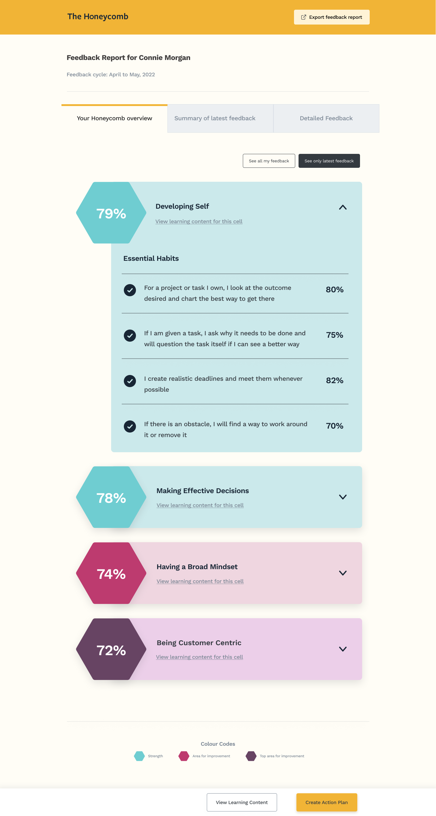
A visual overview using hexagonal score indicators (Strength / Area for Improvement / Top Area for Improvement) colour-coded using The Honeycomb's teal, pink, and purple system. Users get orientation before diving into detail — an immediate, scannable signal of where they are.
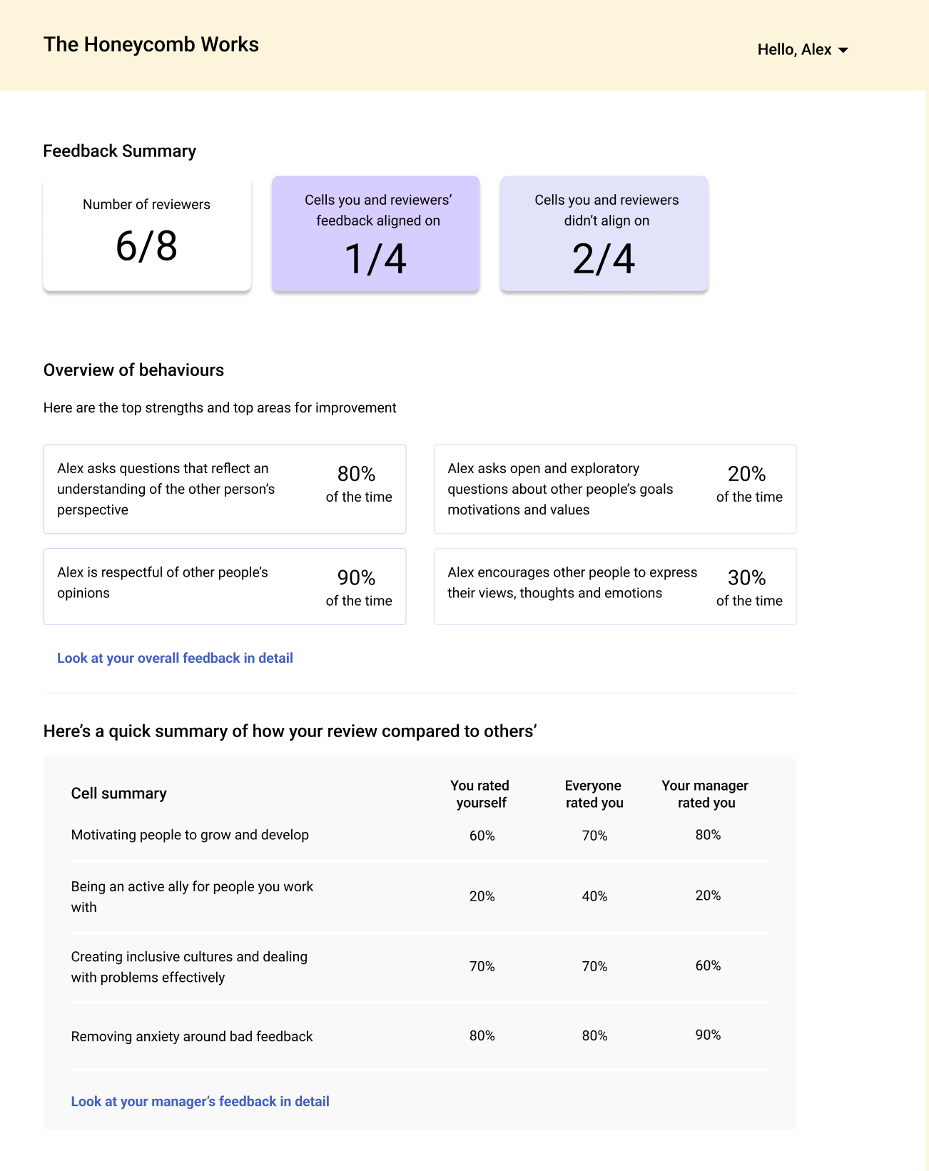
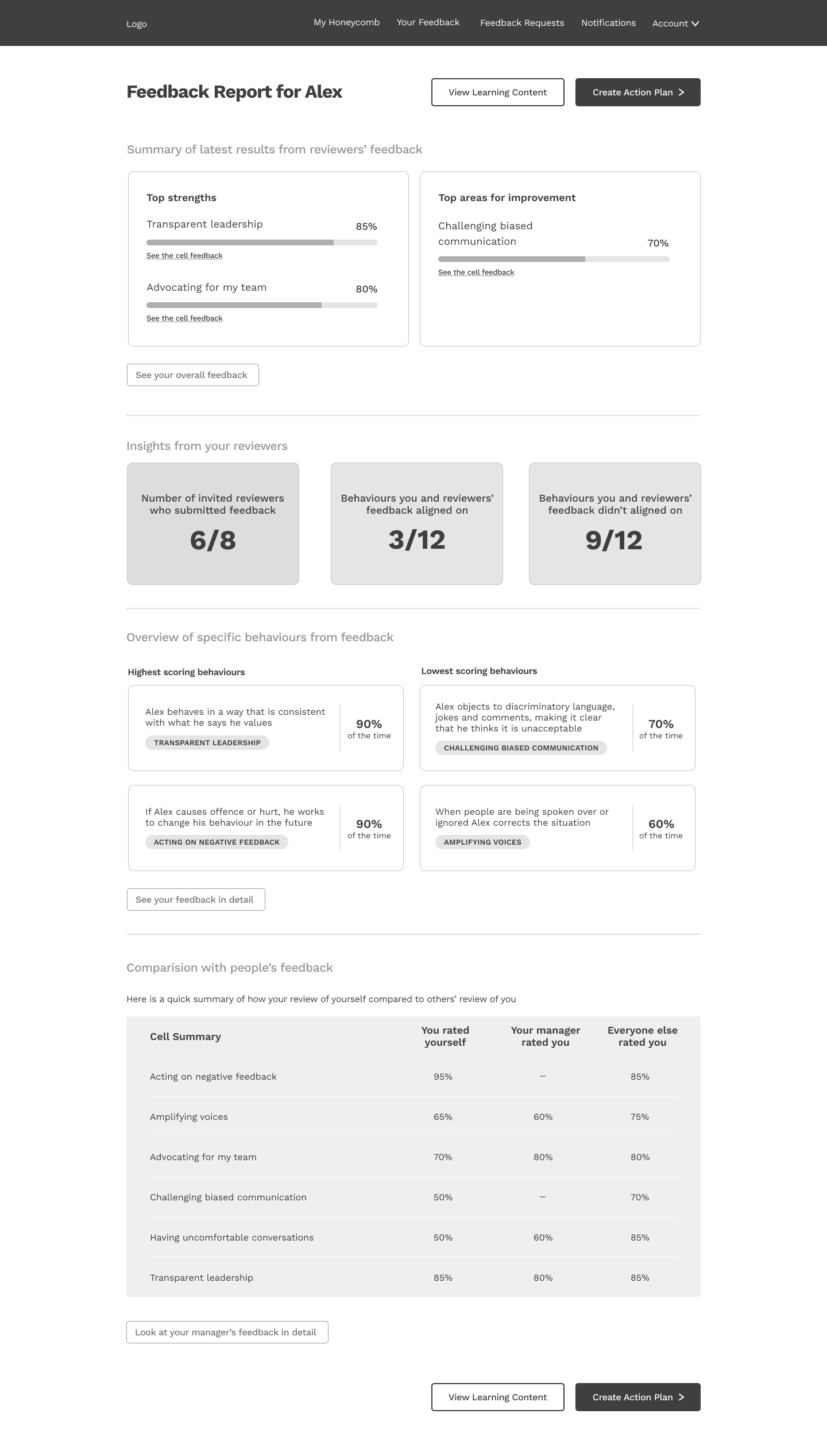
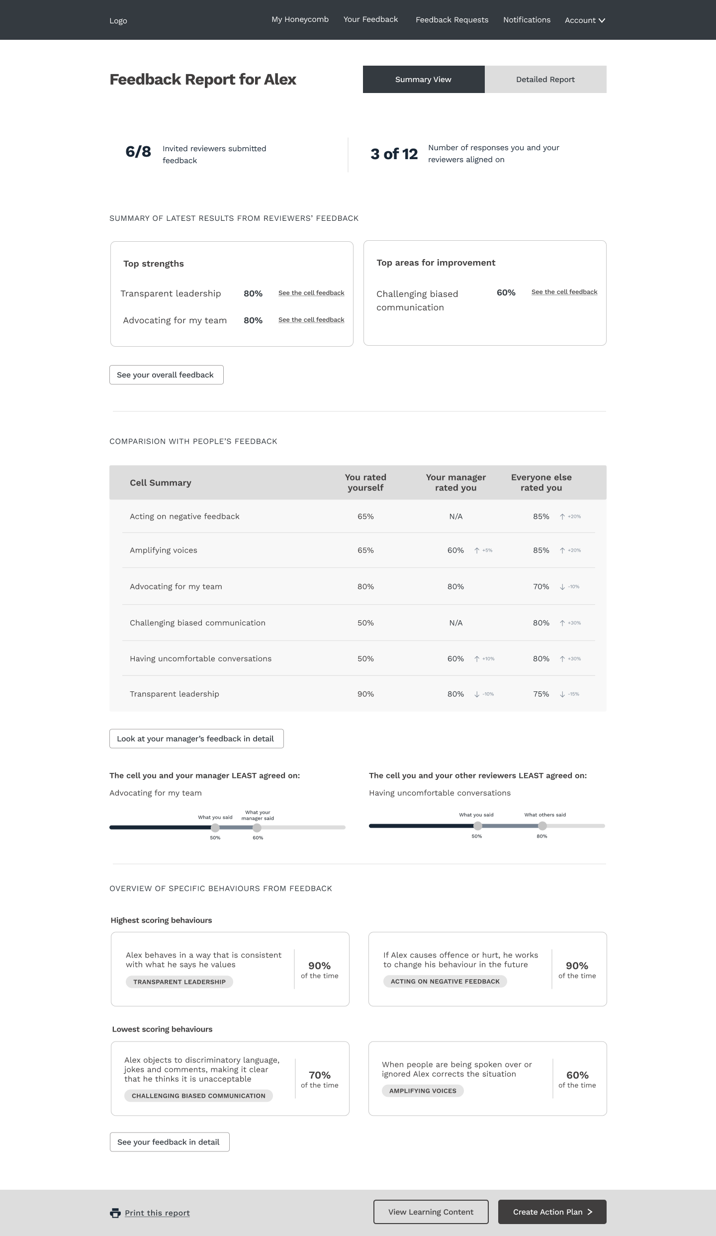
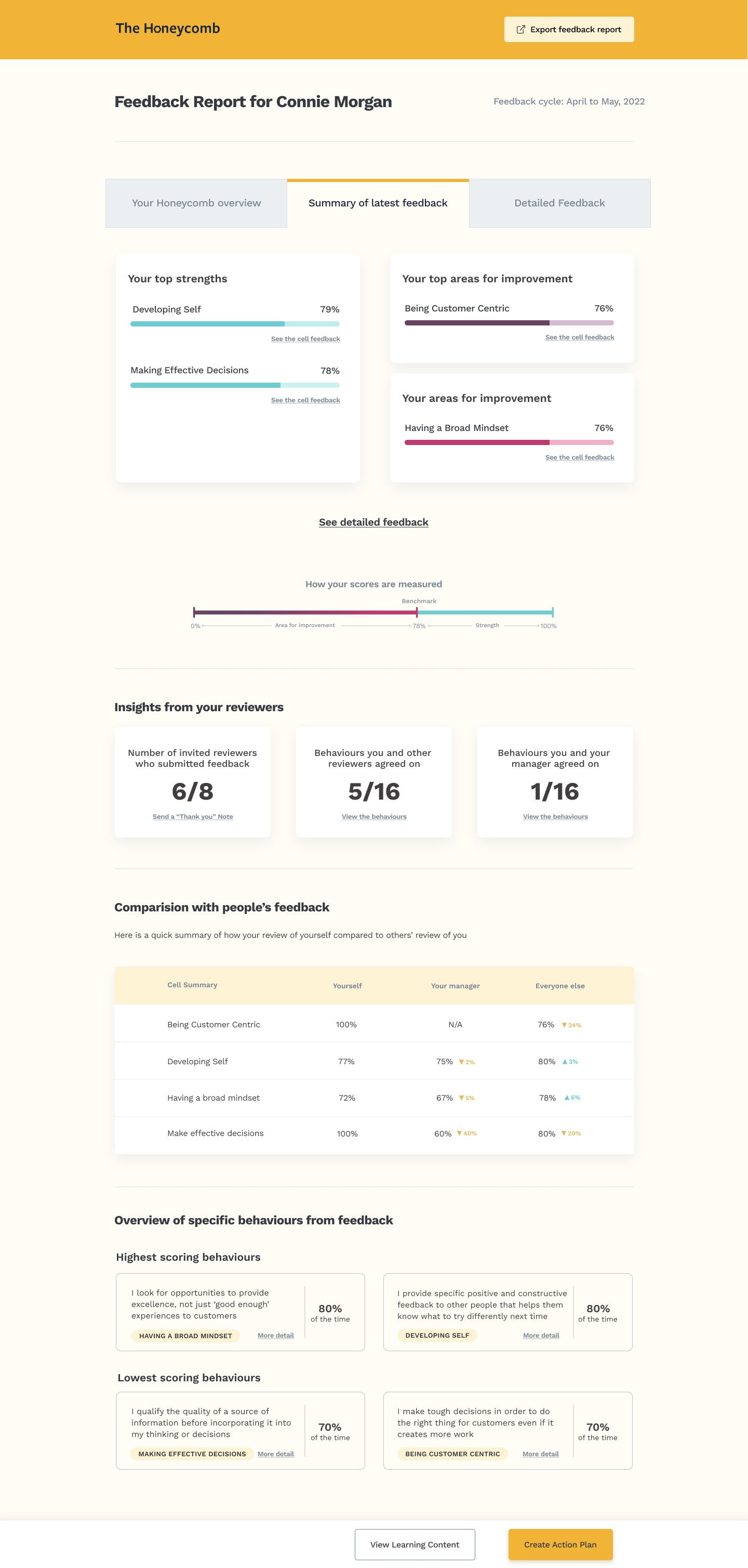
Top strengths and top areas for improvement are surfaced with progress bars and percentage scores. A comparison table lets users see their self-rating alongside their manager's rating and the rating from everyone else — the most powerful section for generating self-awareness.
Individual behaviour-level breakdown with quote cards, first and latest score progressions, and inline links to learning content. Users can track their growth over time and read the qualitative reasoning behind scores.
Wireframes
Final Designs
Key Design Decisions
Leaning into The Honeycomb's visual identity, I used hexagonal shapes with a three-colour system (teal for strength, pink for area for improvement, purple for top area for improvement). This lets users read their standing at a glance before reading a single number.
Showing "how you rated yourself," "how your manager rated you," and "how everyone else rated you" side by side was the single most requested feature after initial testing. The delta indicators (▲/▼ arrows) highlight perception gaps without users doing the mental arithmetic.
Progress is motivating. Adding a score trajectory to the detailed view meant users could see their growth over multiple feedback cycles — not just a snapshot. This was critical for long-term engagement with the platform.
Instead of burying reviewer response rates in footnotes, I surfaced them as a prominent three-column stat block: reviewers who submitted, behaviours aligned on, behaviours not aligned on. This builds trust in the data and context for the scores.
Iteration
The feedback report went through four major design cycles, tested with founders and team members from The Honeycomb cohort. Key shifts across iterations:
Early testing showed users feeling overwhelmed by a long single-page report. Moving to a three-tab structure (Overview / Summary / Detailed) reduced cognitive load and gave users control over depth of engagement.
The self-vs-peer comparison was missing from early versions. After consistent user feedback that "I don't know how others see me differently," I designed the comparison table and tested three different layouts before settling on the final three-column format.
The final iteration added persistent CTAs ("View Learning Content" and "Create Action Plan") anchored to the report. Users needed clear next steps — the report was previously a dead end. Connecting it to the platform's action tools increased completion of learning modules.
Outcomes & Impact
Engagement with action tools increased after adding persistent CTAs. Users moved from reading their report to creating action plans within the same session.
Positive qualitative feedback from founders about the clarity of the comparison view. The self-vs-manager-vs-peers breakdown became a talking point in team conversations.
The tabbed structure reduced support queries about what data meant. Navigation aligned with user mental models: overview first, detail on demand.
Platform adopted by the Royal Academy of Engineering as the feedback tool of choice for their accelerator cohorts, validating the design at an institutional level.
Reflection
Feedback reports are high-stakes. People see data about themselves that can feel threatening, especially if scores are lower than they expected. I learned that the order of information matters enormously — leading with strengths before areas for improvement isn't just UX convention, it's psychologically necessary for people to remain open to the growth-focused content that follows.
If I were designing this now, I'd invest more time in the emotional arc of the report — not just the information hierarchy. I'd also design explicitly for the "difficult report" scenario: a user who receives mostly low scores and needs support, not just data.
This project pushed me to think about design at the intersection of data, psychology, and interaction design.
I'm open to senior product design and design engineering roles — especially with companies solving complex human problems.